Leading Manchester PPC Agency Clickoo Celebrates Over A Decade in Business with a “Stand Out” Rebrand
UNITED KINGDOM / AGILITYPR.NEWS / October 23, 2020 / Leading Manchester-based brand consultancy, Stand Out, delivers a creative “nature meets technology” rebrand for Clickoo, one of Manchester’s most established and highly awarded strategic Pay-Per-Click (PPC) agencies, to mark 11 years in business and a new phase of growth.
Stand Out, having earnt itself a global reputation working with distinguished brands including Mercedes Benz, Wework, Nestlé, and Diageo, was enlisted by Clickoo to create a revitalised brand strategy, identity and website that builds on the agency’s remarkable legacy and positions it for the future.
“We aimed to distance the Clickoo brand from the typical design styles that have long been the norm for agencies and technology brands, highlighting its business’ roots and unique selling points,” begins George James Deeb, CEO of Stand Out. “The concept of the refreshed identity is based on the idea of ‘nature meets technology’ which has enabled us to transform Clickoo’s image and make their brand stand out among Manchester’s saturated digital agency crowd.”

Taking inspiration from the luxury lifestyle and fashion industries, Stand Out’s intention was to build a brand that would spark the same emotional response of calm and tranquillity that is more traditionally associated with these industries, yet at the same time still feel distinctly like an agency.
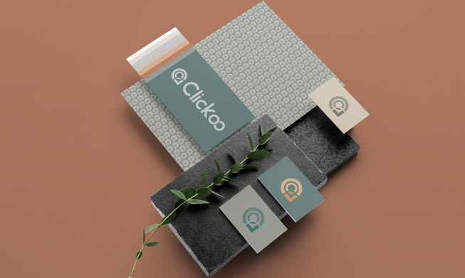
The solution was to represent the agency and technical side of the business in the new logo mark, while provoking the desired emotions through the wider visual identity, such as the colour palette.
“We’d tried to rebrand twice before but got nowhere. Instead of noticing us, agencies were more intent on pushing their own ideas, which just wasn’t working,” says James Galilee, Head of Growth for Clickoo. “With Stand Out, it was a different story altogether. They took the time to really understand us and, as a result, the new branding feels right and makes complete sense. We couldn’t be happier with our new identity as we enter this exciting, new phase for our business.”
Clickoo’s logo mark incorporates a rich collection of apparent and subtle visual links to the brand, as well as its services and history. The ‘C’ and ‘O’ from the name, for example, come together to form a target icon that symbolises its strategic approach. Similarly, the right-angle corner is used to transform the shape into a location marker that represents Clickoo's most important advantage over its competitors: its localisation abilities. Another hidden image - and clever touch - in the logo mark is the outline of a person, which represents the people that Clickoo’s work connects.
The logo is complemented by a new wordmark that incorporates a fully bespoke typeface. It mirrors the new aesthetic of the brand, while still paying homage to the previous visual identity.
Tying it all together is a modernised colour palette, consisting of natural colours that give the brand a calm, organic feel. Stand Out also went a step further and designed a secondary and expanded colour palette, which provides the brand with a comprehensive toolkit they can use to produce illustrated content in the future.
The identity revamp was completed with an entirely new user experience and interface for the Clickoo website. The user interface continues the same organic feel of the brand by doing away with straight lines and sharp corners. The result is a rounded and flowing user experience that’s both unique and expands on the aim of the new brand - the perfect platform to launch the brand into the next decade of operations.
For more information about Stand Out, visit: www.standout.studio
For more information about Clickoo, visit: www.clickoo.co.uk
Contacts
Tom Tawell
PR and Content Account Director
tom@aimcontentmarketing.co.ukAIM Content Marketing
Phone: +44 07940 722109